
01 — Le Contexte
Chaque semaine, une affiche. Chaque affiche, une histoire.
La communication de match, c'est le rythme de fond de la saison. Une journée sur deux, un match. Un match = un poster. Chaque affiche doit sortir rapidement, tenir dans le système visuel du club, et être forte visuellement — même produite en quelques heures entre deux entraînements.
J'ai assuré cette production en continu pour la section D3sur l'ensemble de la saison, puis j'ai été intégré à la gestion de la communication de la section Élite— le niveau supérieur du club, aux enjeux et à l'audience différents.
2
Sections gérées
D3 + Élite
∞
Cadence hebdo
Production en continu
~10K
Vues / post D3
Record club début de saison
02 — Le Système Visuel
Un template. Des variables. Zéro compromis sur la qualité.
La contrainte principale : produire vite, produire bien, produire souvent. La solution : un système de templates par type de match, avec des éléments fixes (grille, hiérarchie, typo Watson) et des variables (photo, adversaire, lieu, heure). Chaque poster est différent. Tous sont immédiatement reconnaissables.
Fixe
— Typographie Watson
— Grille de composition
— Palette Gold / Noir / Blanc
— Hiérarchie à 3 niveaux
Variable
— Photo du match / joueur
— Adversaire + lieu
— Heure et date
— Contexte (domicile / extérieur)

Palette de match
Gold
Signature club
#C9A84C
Noir
Fond dominant
#0D0D0D
Blanc
Texte informatif
#F0EDE6
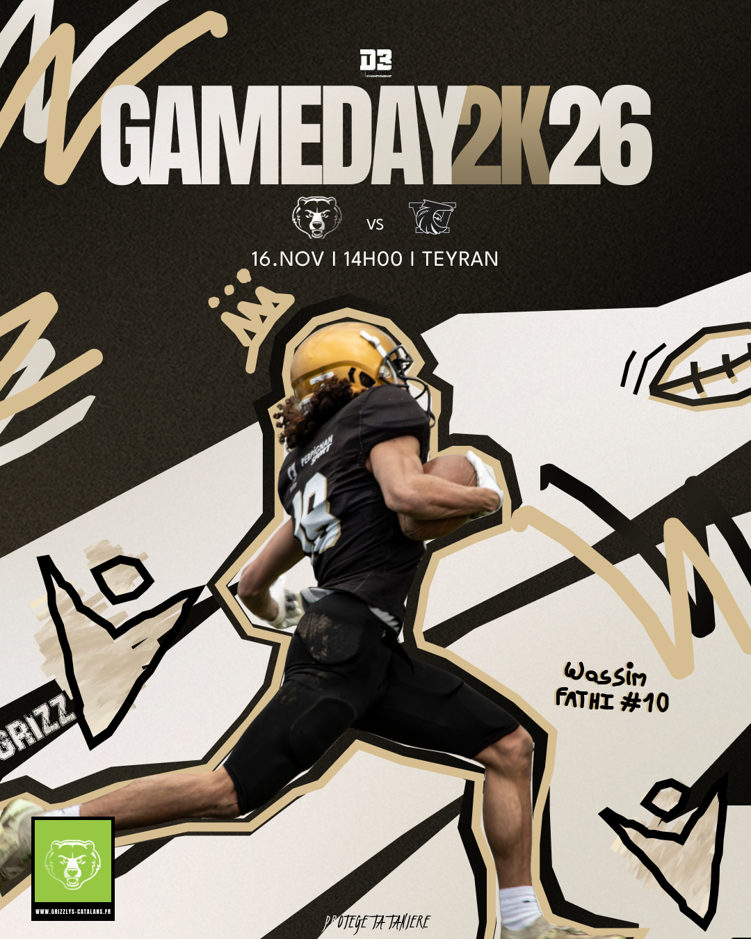
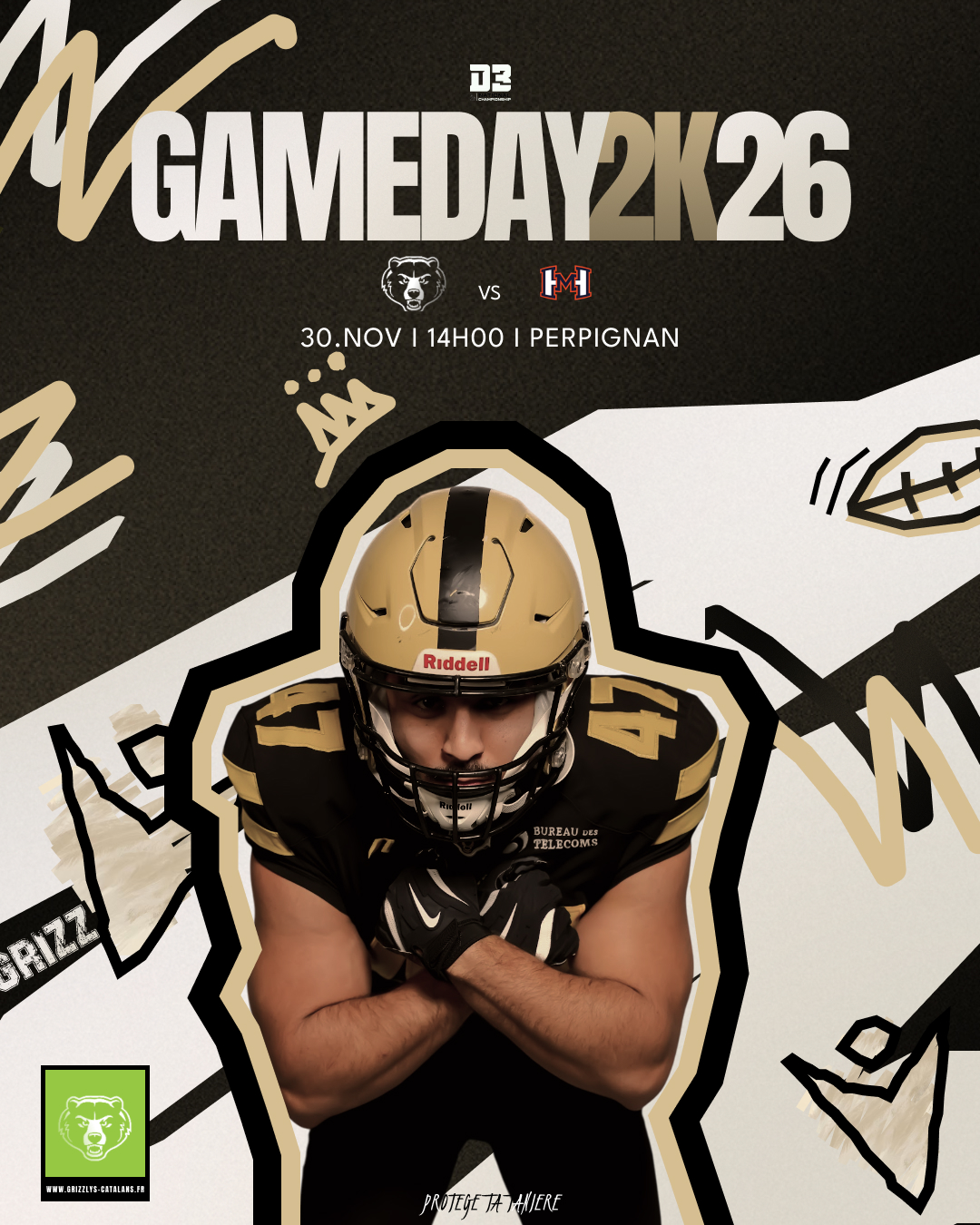
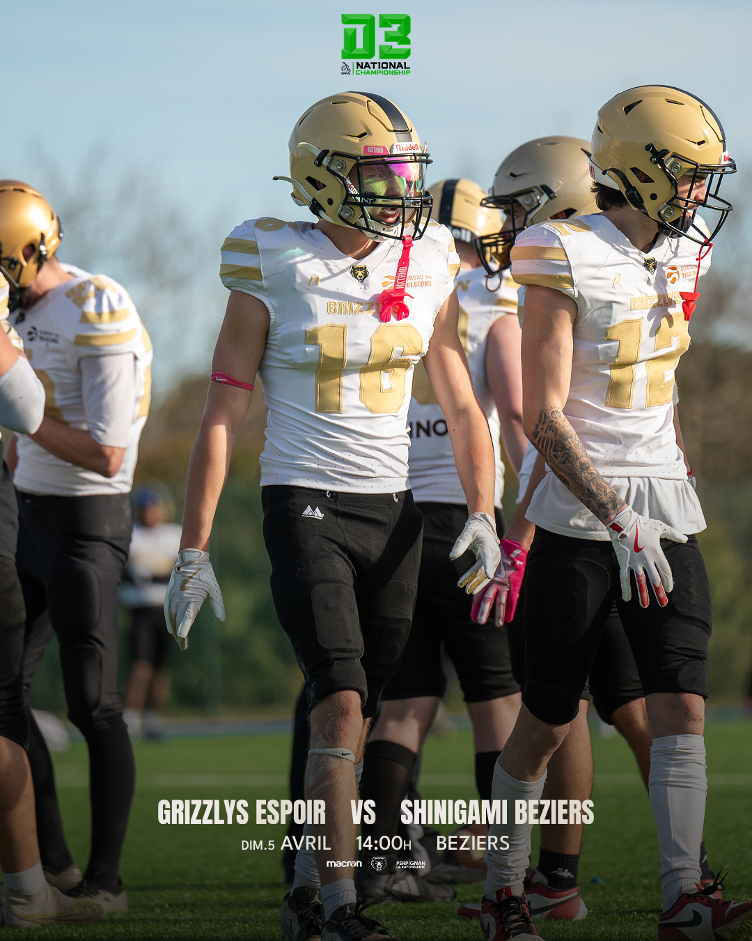
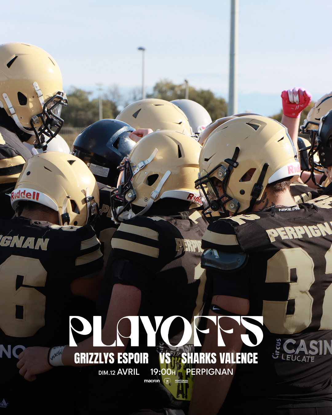
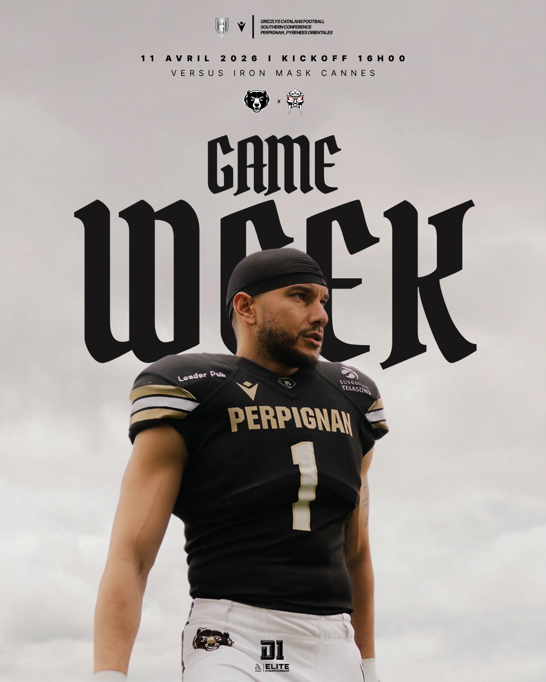
03 — D3 — Saison Complète
Une saison entière. Le même système. Des matchs différents.
Section Division 3. Production hebdomadaire en autonomie — domicile, extérieur, matchs à enjeu, journées courantes. Chaque poster est produit avec les mêmes contraintes : peu de temps, photo disponible, information à hiérarchiser.
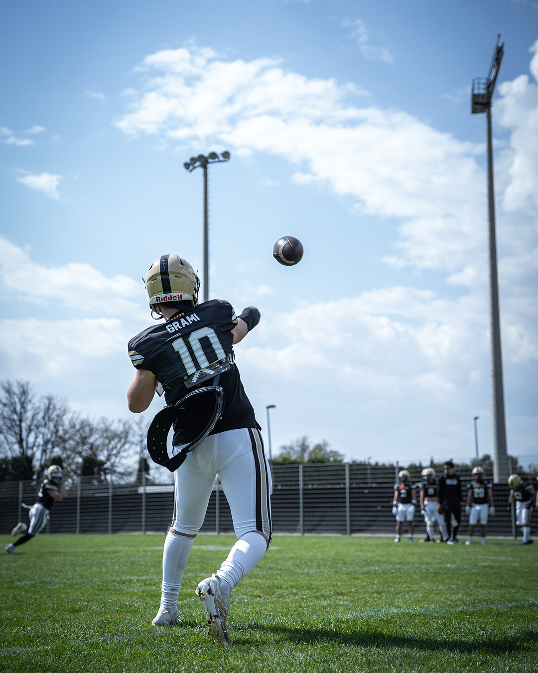
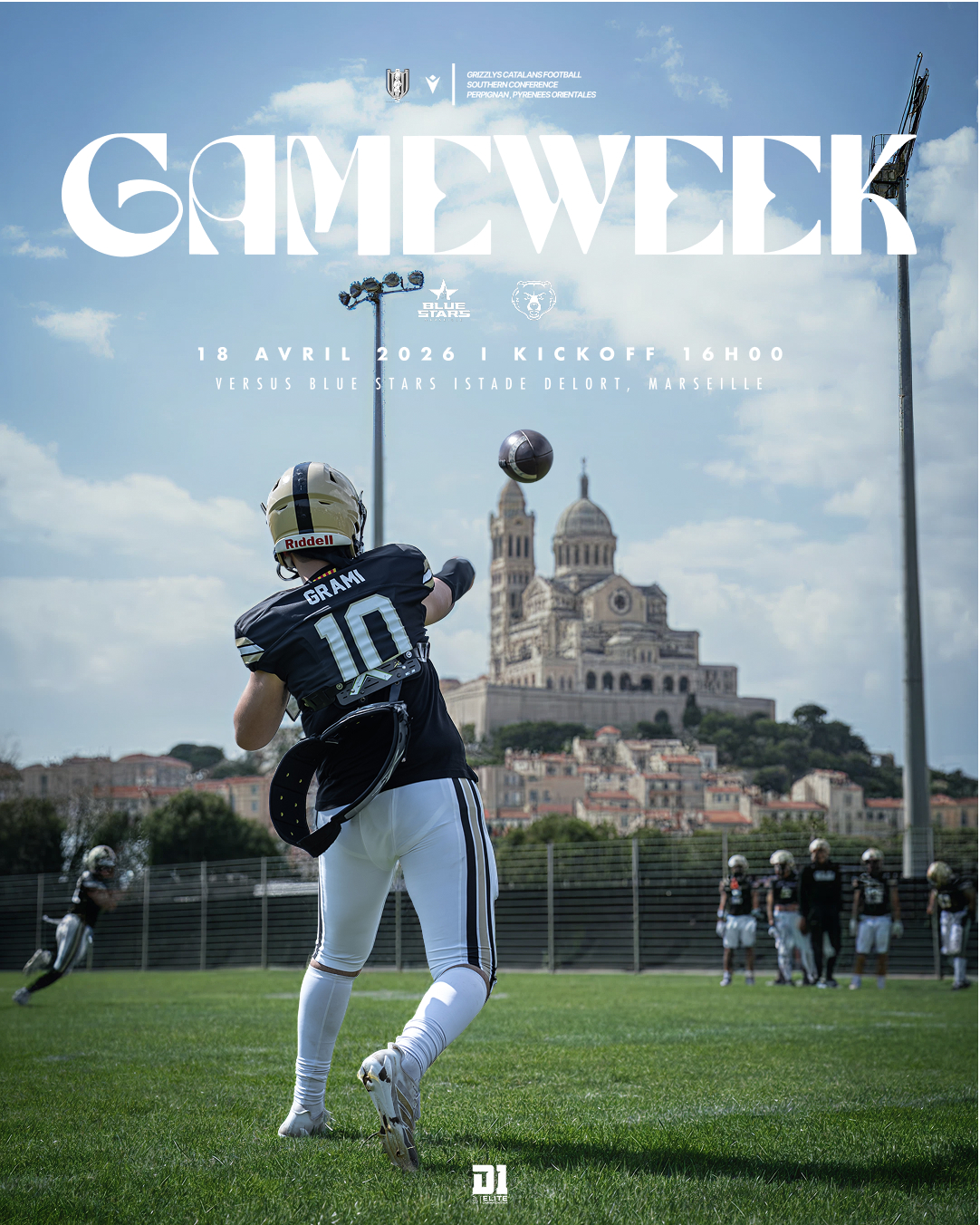
04 — Cas d'étude : Marseille Away
Un poster qui raconte l'extérieur sans le dire.
Match
vs Blue Stars · Stade Delort, Marseille
Étape 01
La photo brute
Point de départ : une photo d'action prise en entraînement — dynamique, authentique, propriété du club. L'image doit porter l'énergie seule, avant tout traitement graphique.
Étape 02
Trouver l'ancre — Notre-Dame de la Garde
Le match se joue au Stade Delort, Marseille. L'insight clé : le décor doit raconter le déplacement. Notre-Dame de la Garde — “la Bonne Mère” — s'impose comme ancre visuelle évidente. Instantanément identifiable, ancrée dans l'identité marseillaise.
Plusieurs angles et distances du monument testés pour trouver la composition qui s'intègre naturellement en arrière-plan, comme si elle était visible depuis le terrain.
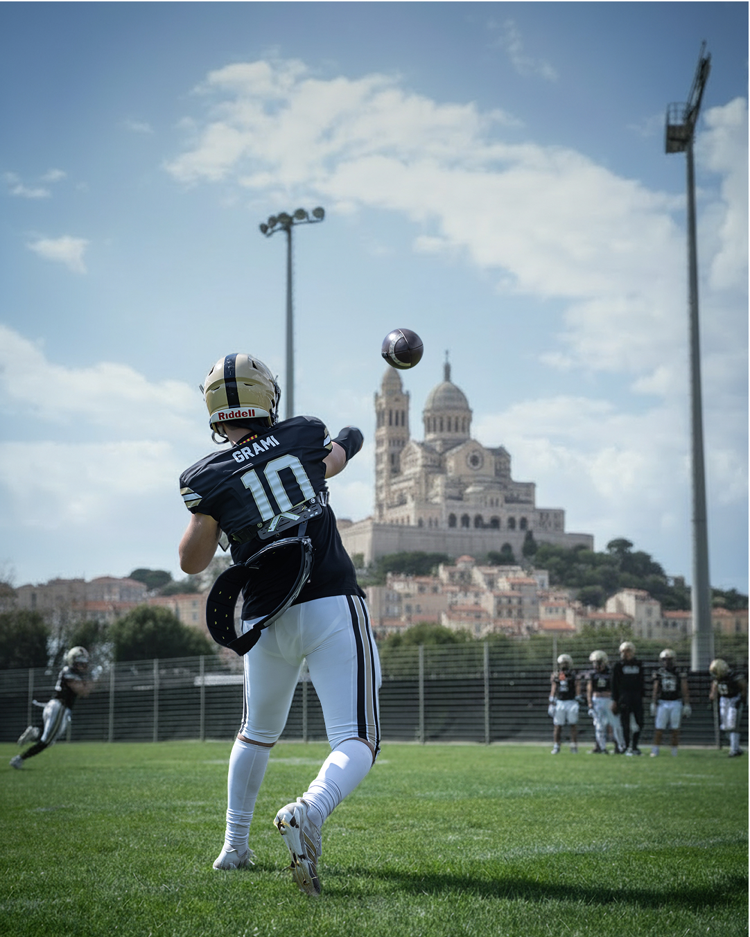
Étape 03
V1 — La composition avant la typographie
Avant de choisir la typo display, on valide la composition image. Le joueur en position de lancer, Notre-Dame parfaitement cadrée en arrière-plan. Le ciel bleu et les nuages blancs dominent la palette — une tension délibérée avec l'identité sombre gold du club. Le bleu et le blanc de Marseille.
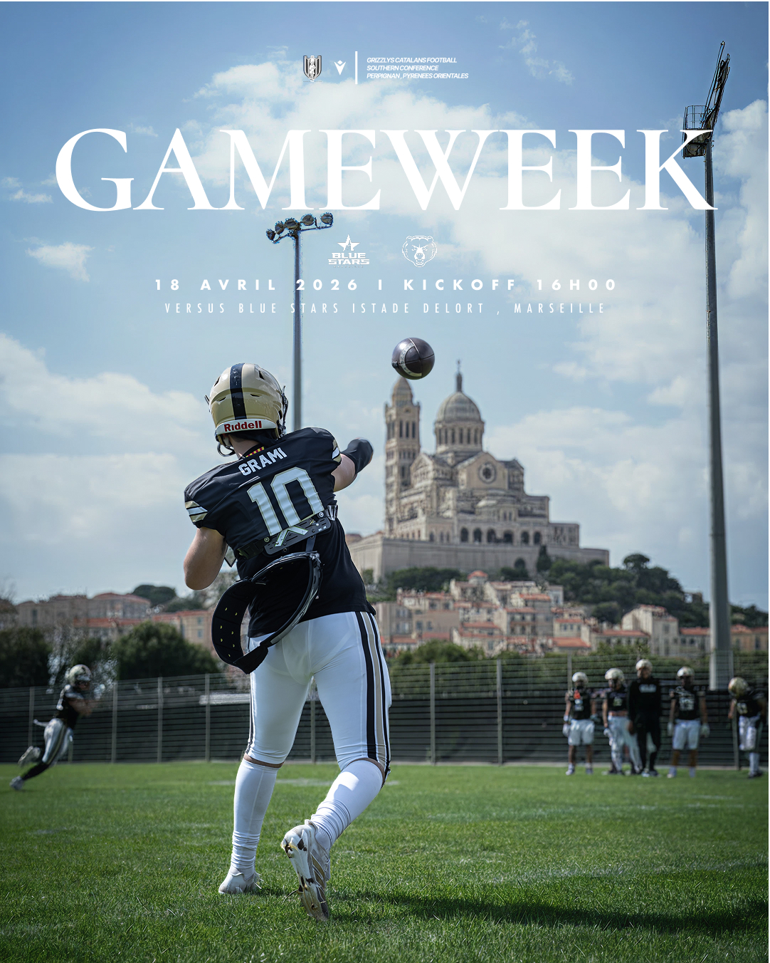
Étape 04
La touche finale — Watson
Watson est sélectionné pour son poids cinématographique. Reconnaissable, fort, capable de rivaliser avec la photo sans l'écraser — et assez distinctif pour devenir un marqueur visuel récurrent sur toute la saison.
Les informations de match — ligue, heure, date, lieu — sont composées en bas en sans-serif condensé et tracké, laissant l'image et le titre porter la charge visuelle.
05 — Stratégie Couleur : Marseille
Jouer dans les couleurs de l'adversaire — volontairement.
L'identité Grizzlys vit dans les tons sombres — noir et gold. Pourtant, pour ce poster, j'ai délibérément sélectionné une photo dominée par le ciel bleu et le blanc : les couleurs exactes de l'identité marseillaise. Cela crée un récit implicite — l'équipe joue en territoire étranger, hostile. Aucune légende nécessaire.
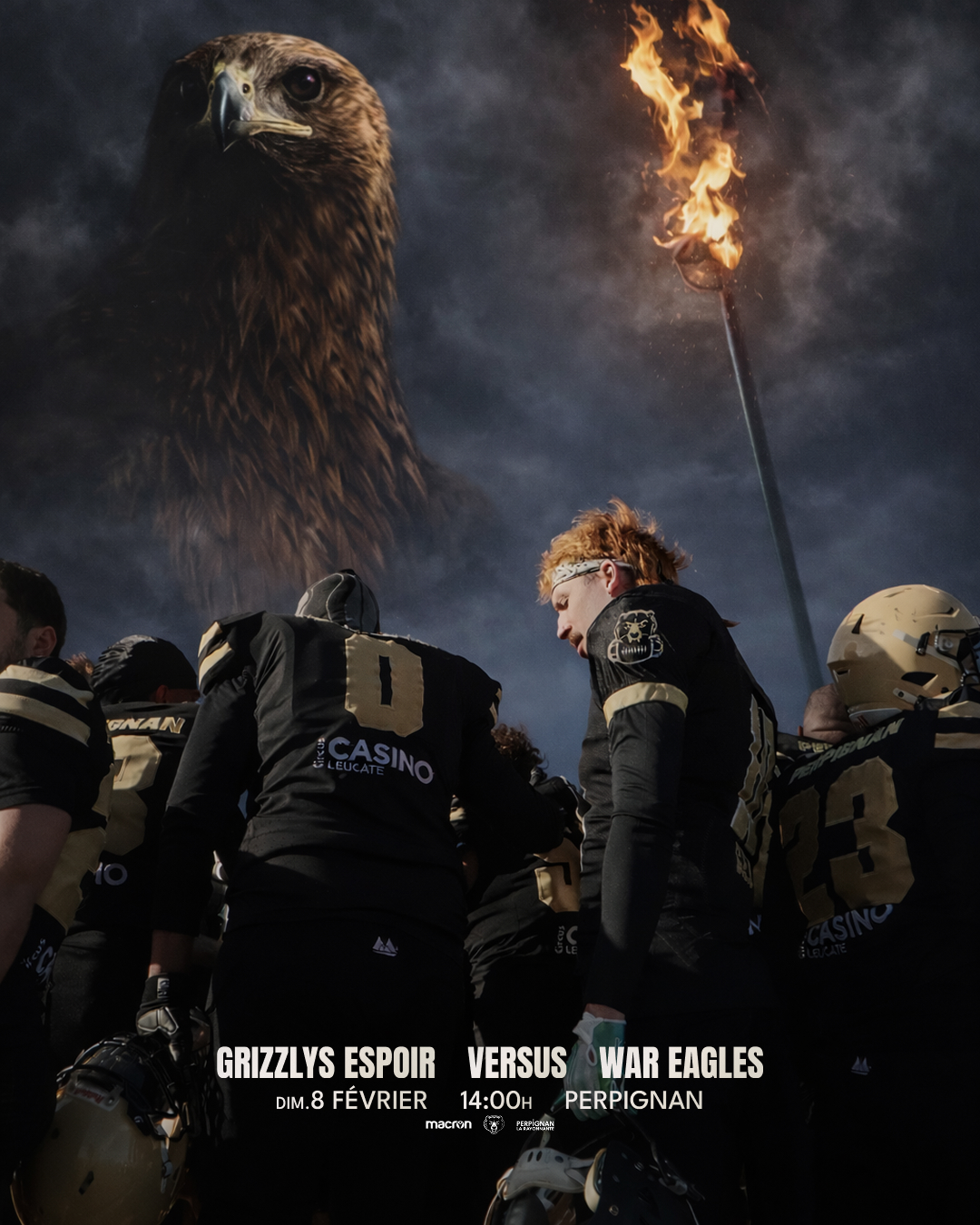
06 — Élite — Intégration en cours de saison
Un niveau au-dessus. Les mêmes exigences.
Intégré à la gestion de la communication de la section Élite en cours de saison. La section Élite représente l'équipe première, avec une audience plus large, des partenaires institutionnels (Macron), et une communication à la hauteur des ambitions du club — qualification Ligue Élite 2027 en vue. Le même système visuel, des enjeux plus forts.
07 — Ce que ça apprend
Produire en contrainte, c'est pas renoncer à la qualité — c'est discipliner son processus.
Un système visuel solide permet la vitesse. Sans système, la vitesse détruit la cohérence.
L'image raconte plus qu'un texte. Le bon choix photo fait 80% du travail.
La DA, c'est aussi savoir quand une règle peut être brisée — et pourquoi.